Intro: Clocks are pretty neat, huh?
The basic point of data visualizations is to condense large amounts of information into something a (comparatively) generic audience might intuitively comprehend.
Examples are clocks and calendars; they are so ubiquitous and intuitive that most people have forgotten that they are, in fact, data visualizations. It takes a moment to remember we actually measuring the earth's position relative to the sun. It's simple, it's clean, it gets the point across — a 5 year old can understand it.
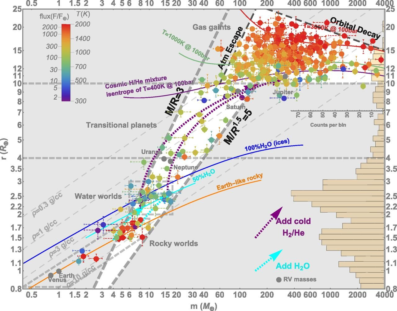
But it seems a lot of people these days have kind of forgotten the point of these data visualizations, because, unlike clocks and calendars, we get stuff like the graph below. It tries to impress us with how much information it seemingly conveys — without really conveying anything at all.
(And yes, this is from an actual published journal.)
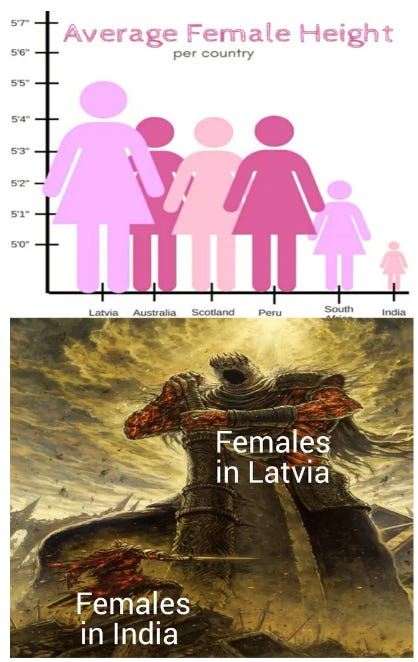
Other visualizations can be simple and factually correct, but nevertheless hilariously misleading:
And then there's this thing.
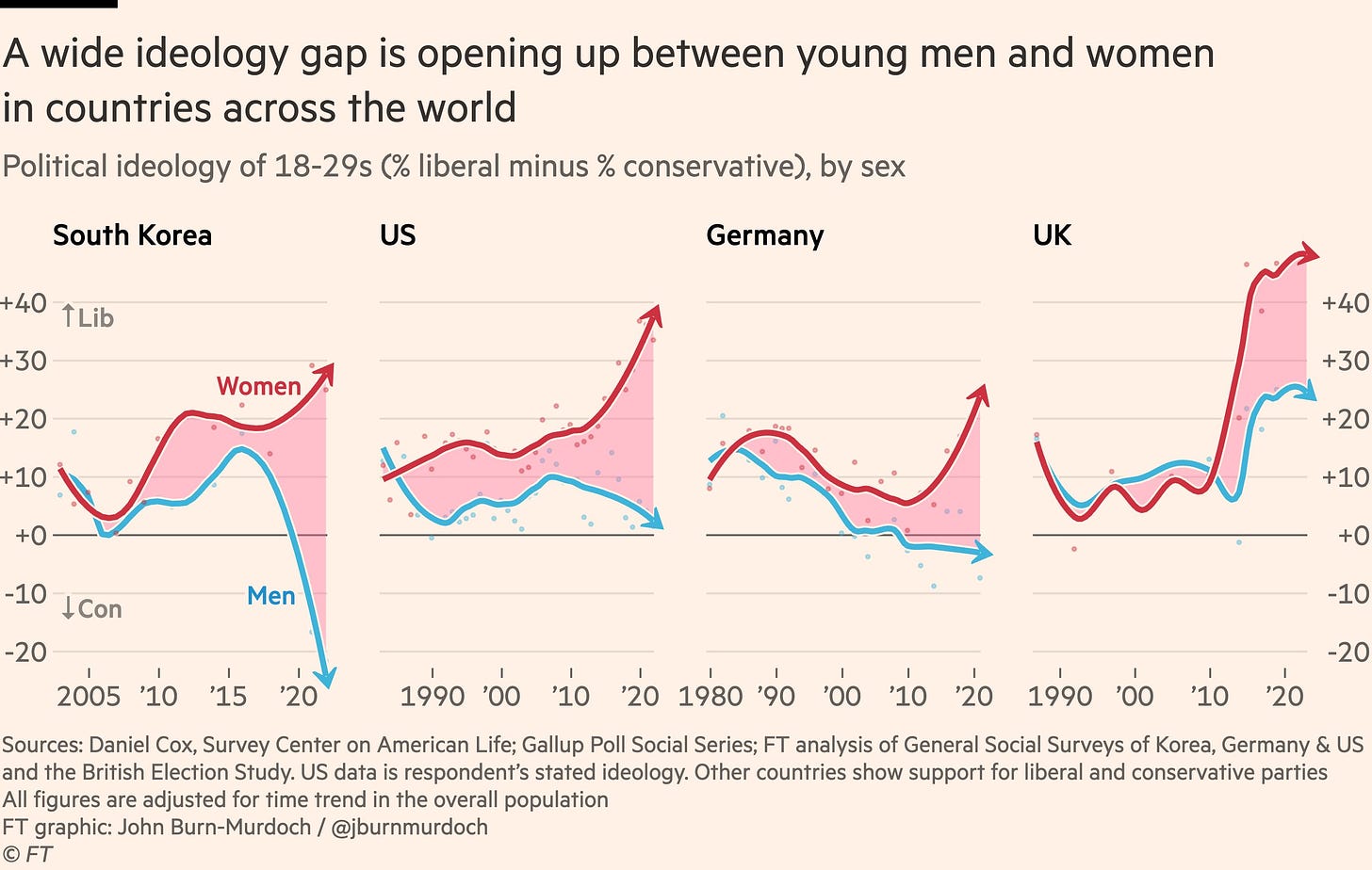
This graph, originally posted by John Burn-Murdoch, is like the Kim Kardashian of graphs; everything I’ve come to learn about it has been against my will. It keeps popping up in the different corners of the Internet, all insisting the same basic punch line: men and women between the ages of 18 and 29 are becoming increasingly polarized.
Culture war aside, it's a great use case for several of the topics that this blog has previously touched on:
I've previously written about how to be a good data detective, which highlights the importance of making sense of data, and understanding the ways that one is being misled with respect to visualizations.
I've also proposed that people don't need to outright lie in order to be biased in their conclusions. Rather, they can simply gerrymander the thought space in which they operate. Scott Alexander makes a similar argument in his post "The media very rarely lies."
Okay, so what's so bad about the graph?
Let's put on our data detective hats.
First, the graphs for each country are compiled from different datasets, with different data collection methods. In this post where I analyzed Kahneman's now famous-yet-kinda-debunked "Income beyond $75,000 doesn't make you happier" study, I showed that slight variations in methodology can lead to completely alternate interpretation of the data.
Richard Hanania makes a similar point here; even when we give people the exact same dataset, people to a completely different conclusion depending on which variables we include or emphasize.
Second, the words "liberal" and "conservative" have different meanings in different countries. Without actually defining them at a more refined level of granularity — and more importantly, ensuring that these definitions are standardized across countries — it's irresponsible to make a sweeping generalization about how ideologies are diverging.
Third, the graph itself heavily implies that this divergence is global phenomenon, despite only taking a sample size of four countries — one in North America, two in Europe, and one in Asia. Moreover, at the risk of stating the complete obvious, even in the Burn-Murdoch graph Gen-Z boys are still more liberal than conservative in the US and UK, and only barely less so in Germany. Only South Korea seems to have a divergence commensurate with the implications of the title.
Fourth, it is worth noting the aesthetic choices made for the graph. Specifically, the red shading in between the two lines, making it seem as if there's this bloody gulf between men and women, as well as the the arrows which suggest that this trend is only going to get worse as time goes on.
Fifth is the fact that Burn-Murdoch very likely removed any non political gen-z people. Let's break that down:
The John Burn-Murdoch graph posted in the Financial Times references a Daniel Cox graph from the Survey Center on American life.
The Daniel Cox Graph is supposedly sourced from the Gallup Poll Social Series, as part of the religion battery. But when I take a look at the corresponding data on religion on their website, it doesn't seem to have anything regarding politics about gen-z.
There is this separate section on party affiliation, however, but it's not broken down by age group. My guess is that there's a paid version which has a more detailed analysis, but I am a broke salaryman.
Nevertheless, even in the non paid version of the Gallup poll data set, we see that about 40% of people don't identify with either of the political parties — and this across all age groups. If we cross reference that with actual voter turn out for Gen-Z (you know, the thing that actually matters when it comes to politics), we find that nearly 80% of Gen-Z people are basically apathetic.
So by taking the midpoint of those two figures, we can make a high school educated guess: about 60% of Gen-Z is relatively apolitical. (I agree this is sloppy in that I'm taking the simple average between two separate data sets; I am more than happy to revise these numbers if there is a proper lineage back to the source data.) Nevertheless, the point still stands that the Burn-Murdoch graph suffers from a sort of base rate neglect, removing the Gen-Z population that simply don’t care about politics.
Five (point five): Another interesting thing to note, which may or may not be relevant, is the fact that these gallop pole Gallup surveys are done by telephone calls. I’m going to go ahead and say that this hardly makes for a representative sample for Gen-Z. I don’t think I’m being hyperbolic when I say that the majority of people under the age of 25 would rather stick their finger through a meat grinder than answer a telephone call from a stranger.
Sixth, and probably the most damning counter argument to Burn-Murdoch graph, is the fact that the finding doesn't replicate when compared to other sources of data. For example:
Ryan Burge found no great divergence in the ideology when referencing the cooperative election data
Allan Downey similarly found a lack of divergence when referencing the General Social Survey data
Morten N. Støstad again found similar findings, although it's not entirely clear which data set he is referencing.
But then why does the Burn-Murdoch graph "feel" correct?
If I'm reading these two studies correctly (1,2), people don't tend to adopt "net new" radical ideologies as a result of what they consume on the Internet. Rather they already have a bias in that particular direction, and the combination two things essentially reinforce those biases:
An algorithm serves you a number of different options in the online world
A lack of contact with the offline world
In other words, the best way to stress test radical world views, is to *checks notes* talk to people in real life. Unfortunately, with the pandemic, an increasingly large number of people didn't have the opportunity to do that, which led to a sort of self reinforcing loop.
So my guess is that our conservative uncles and liberal high school friends both fell into the respective deep ends of their worldviews during the pandemic, and they tend to be the loudest voices in the room in terms of online discourse.
Nevertheless, it's important to understand that that is different than what Burn-Murdoch is measuring; his graph doesn't show the degree to which Gen-Z men and women are political, but rather the percentage total — which, based on the reasons outlined above, is a dubious divergence at best.
But ultimately none of this analysis really matters, because the Murdoch graph isn't really a graph. It’s a Rorschach.
People will see from that graph exactly what they want to see from it, regardless of the underlying reality.
For example, on the Gen-Z subreddit, the graph received nearly 27,000 comments. Considering the discussion was male dominated, the comments were exactly what you might think to expect.
In other places, where the discussion was more female dominated, the comments were, well, also exactly what you might expect.
(If you're going through the two comment sections, and find yourself completely agreeing with one while rolling your eyes at the other, consider that you might have a gerrymandered worldview.)
Regardless, the issue here isn't with men or women. It's with people like John Burn-Murdoch, who intentionally post this salacious graph under the guise of objectivity.
Data is supposed to be the gateway to truth, and people like Burn-Murdoch intentionally torture obfuscate the data in order to fit their pre existing narratives, and as long as the incentives are aligned as they currently are nobody will hold him accountable for it.
But anyways, clocks are pretty neat, huh?


Clocks are neat. Especially pocket watches. Did you know you can carry time in your pocket? It's magic!
Also, they may not know it but I'm on a mission to save all the tiny Indian ladies from the monstrous Latvians. That graph and rendering are so scary! 😂